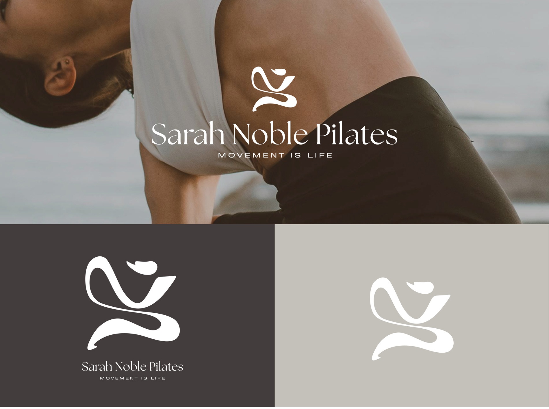
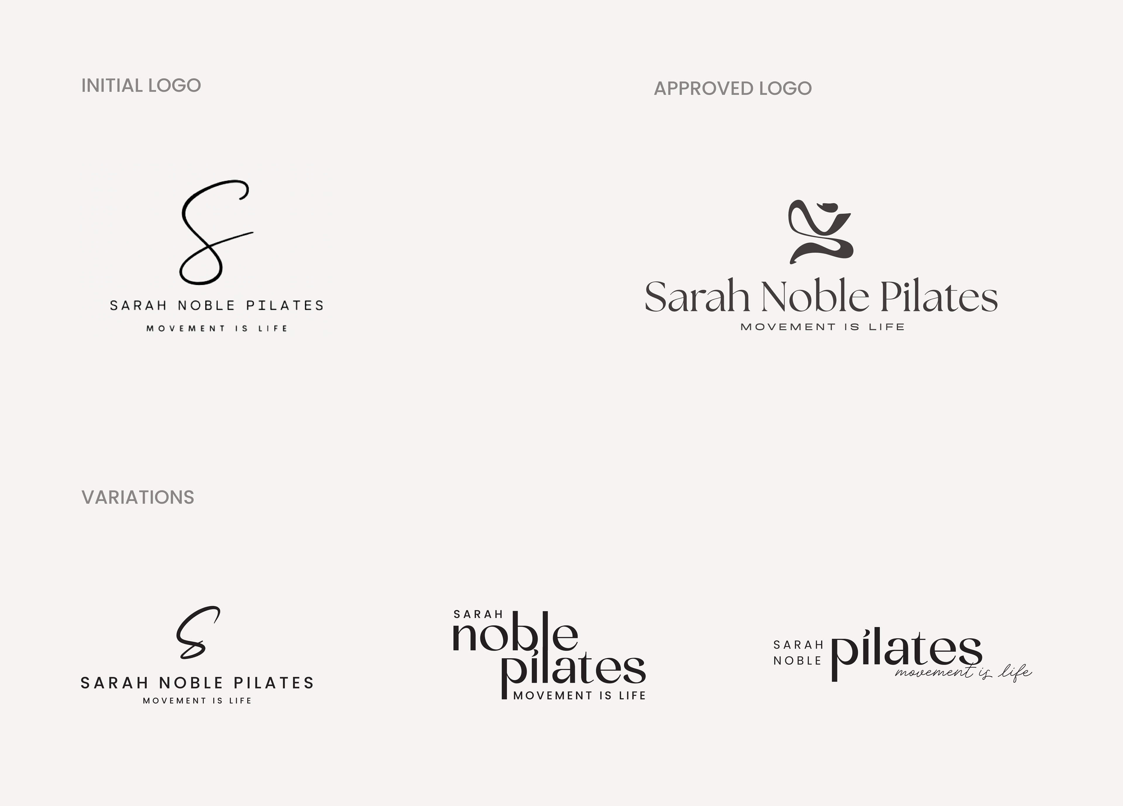
The client approached me with the goal of refreshing their brand identity. The original logo felt outdated and lacked presence, especially in digital formats. They wanted something that looked more modern and confident, while still reflecting the calm, balanced energy of Pilates.
I focused on creating a logo with a stronger visual impact by improving the structure, contrast, and typography. The updated design uses cleaner lines and a more defined shape, which helps it stand out across different platforms—both online and in print. We kept the feeling of movement and flow, but gave it a clearer, more professional look.
This redesign helped the studio feel more aligned with its current values: strength, clarity, and focus. It now communicates trust and quality to new and existing clients.
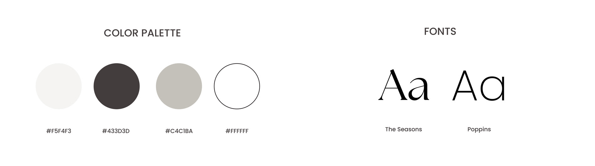
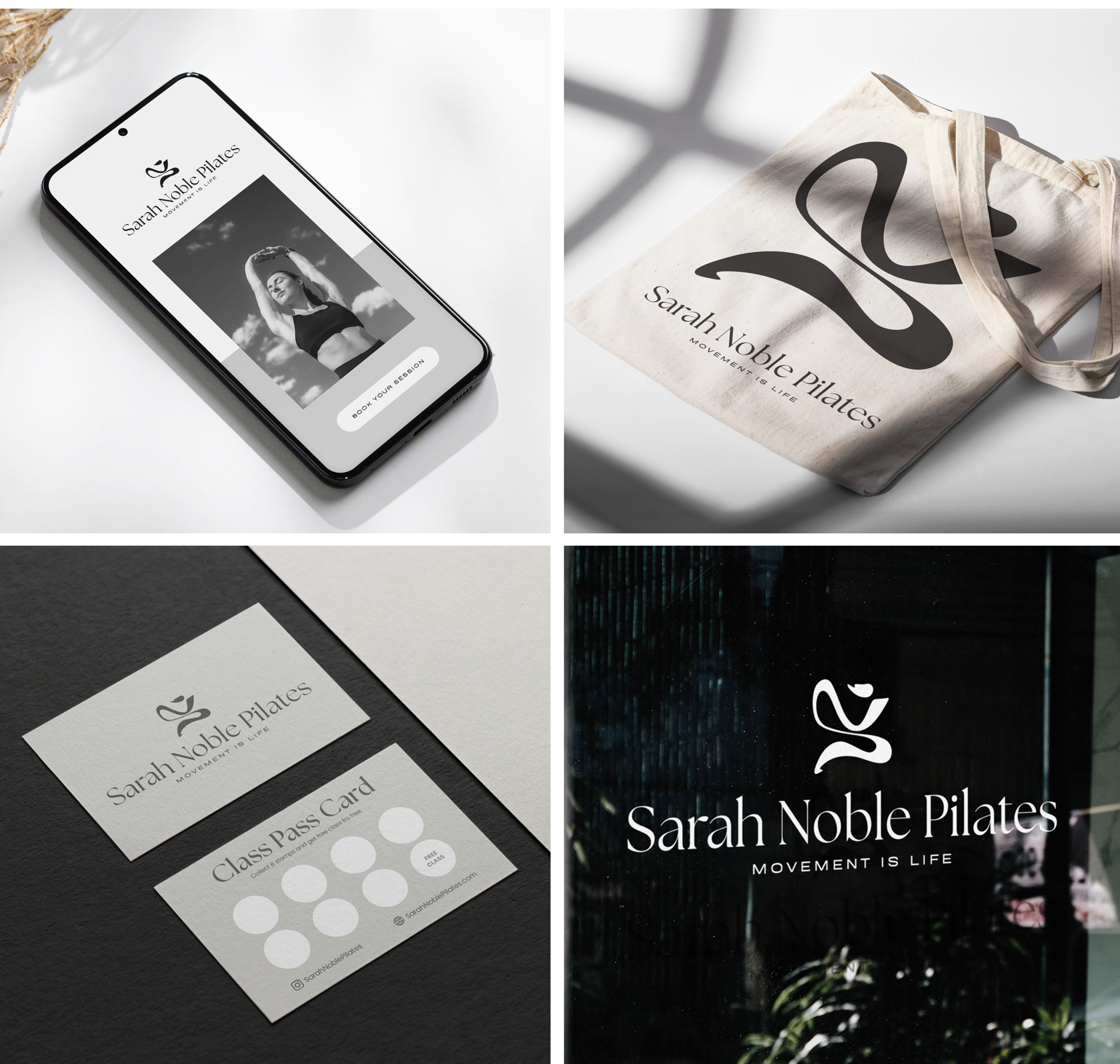
As a final touch, I created a succinct brand board to define the vision and the visual application of the new logo, to make it easy for the client to maintain a consistent look and feel for the future brand collateral.